
A Wicked new look for Oz.
Case study
The Performance Factory, a leading stage school in South Wales, approached us to design a poster for their upcoming production. They wanted to combine the classic charm of The Wizard of Oz with the fresh, exciting elements of its prequel, appealing to both loyal fans and new audiences.
Overview
The challenge for Wonderdog was to capture the magic of the original while also incorporating the darker, more complex themes of the prequel. We needed to find a way to balance both stories and create a design that would spark excitement for the production and work across all marketing platforms.
Challenge
Highlight the contrast between good and evil by showcasing both light and dark elements of the production.
Ensure the final design works in both portrait and landscape formats, making it suitable for print and digital media.
Use typography that balances classic and modern styles, capturing the essence of the story while feeling fresh and contemporary.
Objectives


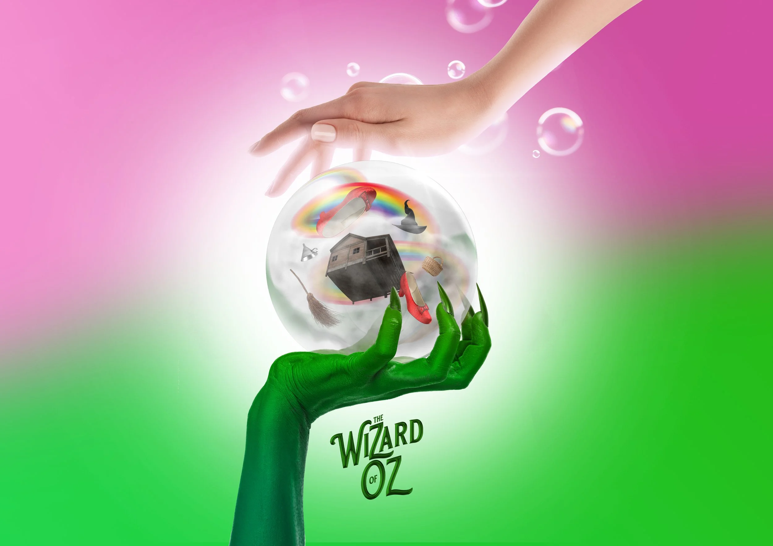
The Performance Factory’s custom poster design brought classic Wizard of Oz elements to life inside a central magical orb, echoing the iconic storm that sweeps Dorothy into Oz. By combining key imagery, we crafted a design that effortlessly ties the timeless tale to the fresh narrative of its prequel. The final result is a bold, eye-catching design that grabs attention and makes the perfect keepsake for both fans and audiences.
Conclusion
“We've had a long-standing relationship with Wonderdog, and once again, they’ve delivered nothing short of stunning with their design for our ‘Wizard of Oz’ production poster. They perfectly captured the timeless magic of the story while adding a fresh, modern twist that made it pop. The vibrant colours, bold typography, and iconic imagery were all spot on. Wonderdog took our ideas and feedback and turned them into something even better than we imagined. The poster has already garnered great feedback and is generating excitement for the show.”